White Carrara Countertops, 1988-2012, RIP
BY SARA RUFFIN COSTELLO
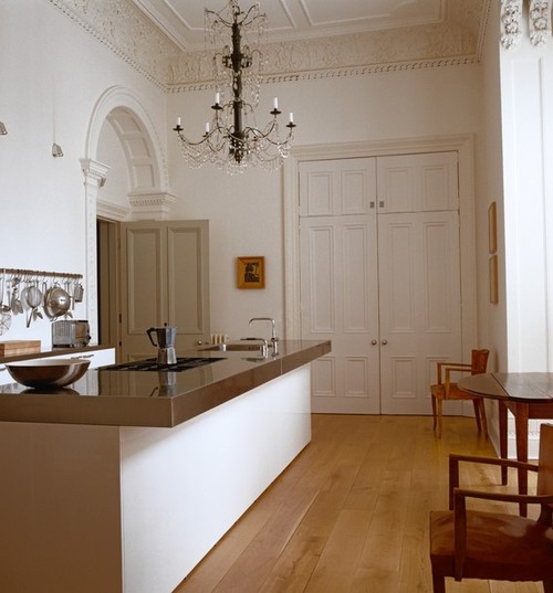
: The ratio of modern stainless counter to old-lady molding in this kitchen makes a formidable statement. Fritz von der Schulenburg/Interior Archive
I’VE BEEN DEVOTED to the goes-with-everything look of honed white marble countertops for years, using Carrara in three of my own kitchen renovations—traditional town house, gritty loft and Adirondack cottage—as well as recommending it to clients. Dormant since the 1920s, marble countertops resurfaced in the late ‘70s, perhaps thanks to the allure of pared-down opulence at Dean & Deluca’s groundbreaking grocery in New York’s SoHo. By the '80s, Martha Stewart, an early adopter, helped make the stone ubiquitous.
Day one of my first paying job post-college, I walked into the country-sleek Connecticut kitchen of my new boss, Martha Stewart. Elbows on the chunky marble counter, she was making out a grocery list for me. I was to pick up 27 Cornish game hens, 30 heads of Swiss chard, seven bags of blood oranges for juicing and a few other foreign-sounding items. When I returned hours later with a prodigious amount of succulent produce and fowl, the house was Martha-free, allowing me an unfettered snoop at domestic supremacy.
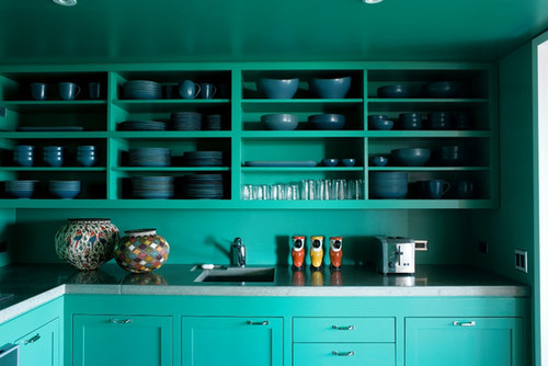
Charcoal-hued soapstone is less contrast-y with bright colors than white marble would be. William Waldron/Interior Archive
Martha had two nerve centers: Kitchen A in the main house for standard meal prep and everyday glue-gunning situations, and Kitchen B in the guesthouse for handling superhuman cooking projects and extreme crafts. These work rooms were about elevating suburban ideals with the factory precision of a sweatshop in Taiwan. I sensed the advent of something big. Bossy Boots fetishized the homely arts, making them glamorous for the rest of us. She shined the spotlight on the room at the heart of it—the kitchen. And that kitchen should have marble counters.
Martha left me a voicemail later that night: “You bought everything wrong. I had to return it all.” I vowed to study this flawless creature. The next 365 days were spent leaning over Kitchen A’s Carrara countertops, wiring wreaths or glue-gunning ribbon onto dehydrated fruit for the holiday issue. That was the mid-'90s and nearly everybody I knew wanted a kitchen like Martha’s.
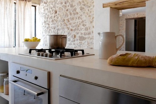
Light but still a heavyweight, a polished concrete counter becomes an all-in-one island. Nicolas Mateus/GMA Images
Today, her stranglehold has loosened (slightly). I will never stop loving her perfect white Carrara countertops, but I’m ready for something a little…less virtuous. My friend Mary Vesta, in the midst of springtime renovation angst, is determined to reinvent her own scullery. Our eyes practically bled from scouring Pinterest for inspiration, but it does yield fresh results. We had been looking for next-level countertop ideas—Corian and glossy laminates—but wound up gazing at old friends like stainless steel, soapstone and cement.
The throughline of our favorite images was obvious. We gravitated toward rooms that were a stew of modern utilitarianism mixed with traditional elements and a generous dollop of real-life charm. A rather complicated analogy would be if clean-lines architect John Pawson were married to American decorator Bunny Williams, but had an affair with naughty chef Nigella Lawson—their collective baby would be our dream kitchen.
In the surface department, our dark horse winner was nonporous stainless steel, which dulls and scratches, in a pretty way. Zinc and copper were runners up, scoring points for rarity and one-of-a kind patina. Incidentally, copper also happens to be the most antibacterial metal out there. According to the “International Journal of Food Microbiology,” E. coli can survive on stainless for 34 days while on copper it dies after two hours.
Resale is a frequently used word in Mary Vesta’s reno, and for that reason we gave a third-place ribbon to chalky gray soapstone, which, while lending a noir drama, plays it safe. Finally, concrete rated an honorable mention for being tint-able and somehow both textured and smooth at the same time. While Mary Vesta isn’t the CEO of an important domestic empire (yet), she’s on the verge of saying something original in her kitchen: Goodbye, Carrara; hello, zinc.
—Ms. Costello is a writer and design consultant based in New Orleans.
_________________________________________________________________
Counter Intelligence
Details like thickness and shape clarify a kitchen’s overall look
Thickness: The more extreme the profile, the stronger the statement.
•¼-inch surface reads sleekly modern—better for metals like stainless, copper and zinc
•1½-inch profile is safe and traditional—suitable for everything
•3 to 5 inches telegraphs luxury—suitable for everything
Shapes: Seemingly minor, but a critical detail.
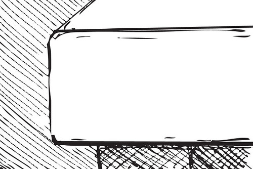
Soft Miter: Clean. Best with traditional cabinets. Illustrations by DSM
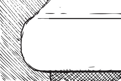
Bullnose: Traditional. Best with modern cabinets. Illustrations by DSM
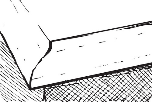
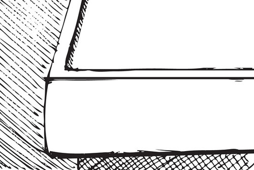
Marine Edge: Clean with extra detail. Best with modern or classic cabinets. Illustrations by DSM
